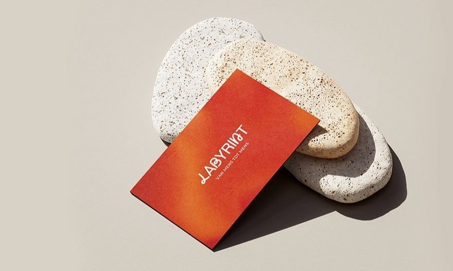
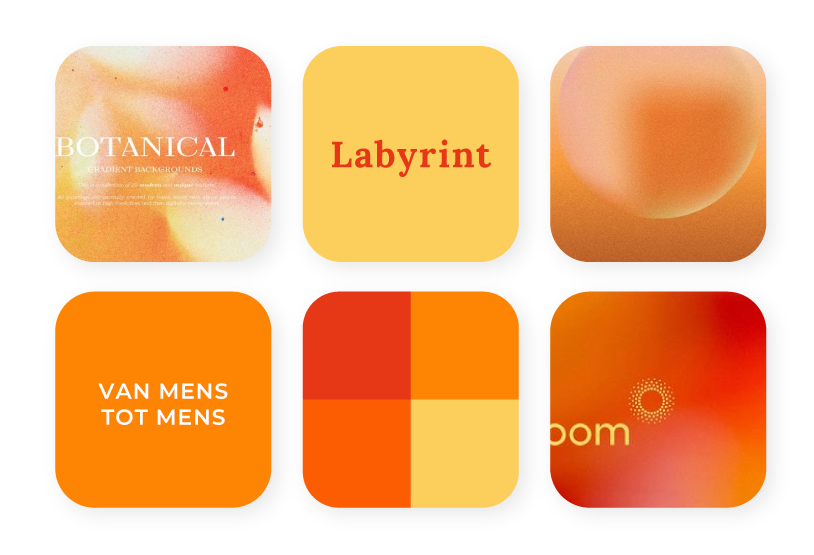
Labyrint
Rooted in the warmth of chakra-inspired tones, with a focus on deep reds, this identity captures the emotional depth and natural flow of the therapeutic journey.
Client: Labyrint
Project: Brand Identity
Year: 2024
Services: Brand Identity, Graphic Design

Labyrint
Rooted in the warmth of chakra-inspired tones, with a focus on deep reds, this identity captures the emotional depth and natural flow of the therapeutic journey.
Client: Labyrint
Project: Brand Identity
Year: 2024
Services: Brand Identity, Graphic Design
about
About Labyrint
Labyrint Practice for Nature and Psychosocial Therapy, founded by Desiree Veelen in 2012, offers personal and nature-based therapy for people of all ages. With years of experience in care and coaching, Desiree strives for a personalized approach, both individually and in groups. Labyrint Therapy helps clients regain their balance in a peaceful, natural environment.
goal
Project Goal
The goal was to develop a fresh, new visual identity that reflects the core values and unique characteristics of the business. Over the past few years, her company has undergone significant professional growth. Naturally, this also required a professional appearance that communicates the high-quality service to her clients.
REVIEW
Client Words
Calm, warm, and beautifully aligned with my vision. After 15 years, my business had outgrown its original branding. Sanne truly listened and translated my vision into a thoughtful, beautiful new identity. Despite working remotely, the process was smooth, clear, and collaborative. I’m so happy with the result. Thank you so much!
behind the process
Curious how we got here? Here’s how I explored visual directions through moodboards before landing on the final identity. These moodboards serve as inspiration and are a starting point for the design—never the final outcome.
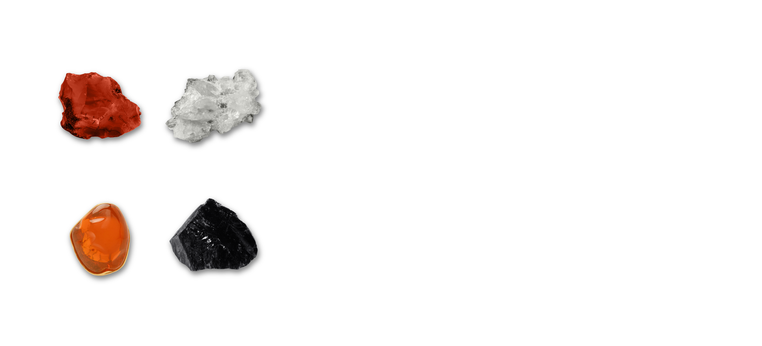
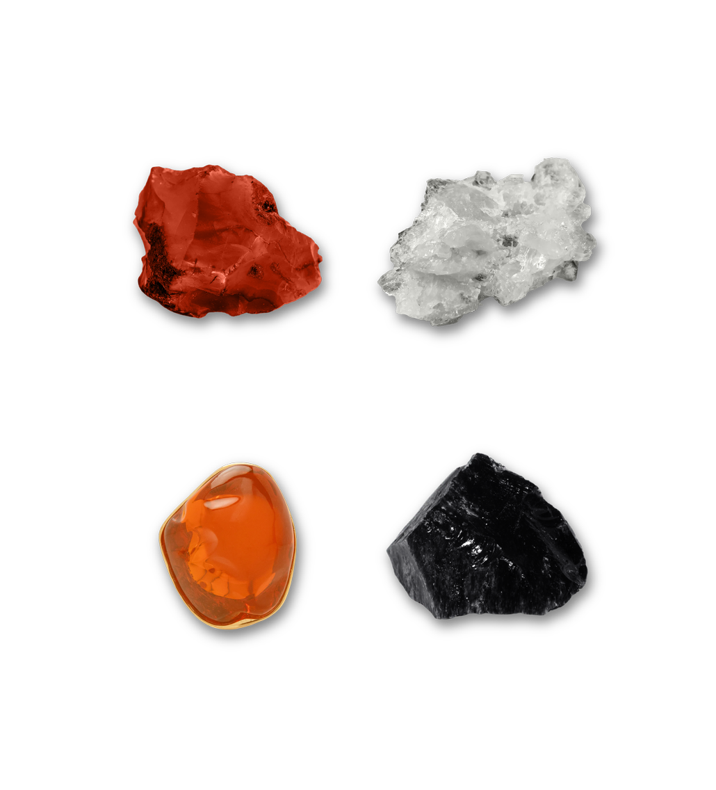
lower chakras
Inspired by chakra colors, this concept represents the body’s energy centers and their role in healing, balance, and well-being. Blurred textures and soft gradients reflect the fluid, transformative nature of therapy, while vibrant tones—from deep reds to warm yellows—create a harmonious and inviting atmosphere. Organic shapes and a layered color approach add a calming, natural feel.
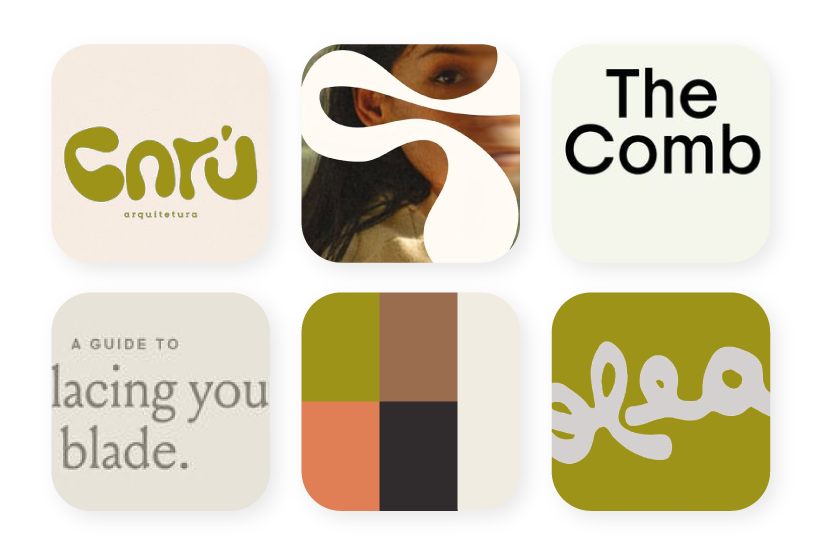
A Harmonious Fusion
While Moodboard 1 served as the foundation. Thanks to its rich chakra-inspired colors and calming gradients—the final design also incorporates elements from Moodboard 2. The natural, flowy curves from this second direction were translated into the custom logotype, adding an organic, grounded touch to the overall identity.
natural flow
This concept focuses on natural simplicity, using earthy tones and organic shapes that also echo through the typography. The palette, inspired by nature, radiates calm and groundedness—reflecting the peaceful environment the therapy offers.